Website

Logo

Brand

Cymulate Cybersecurity Company

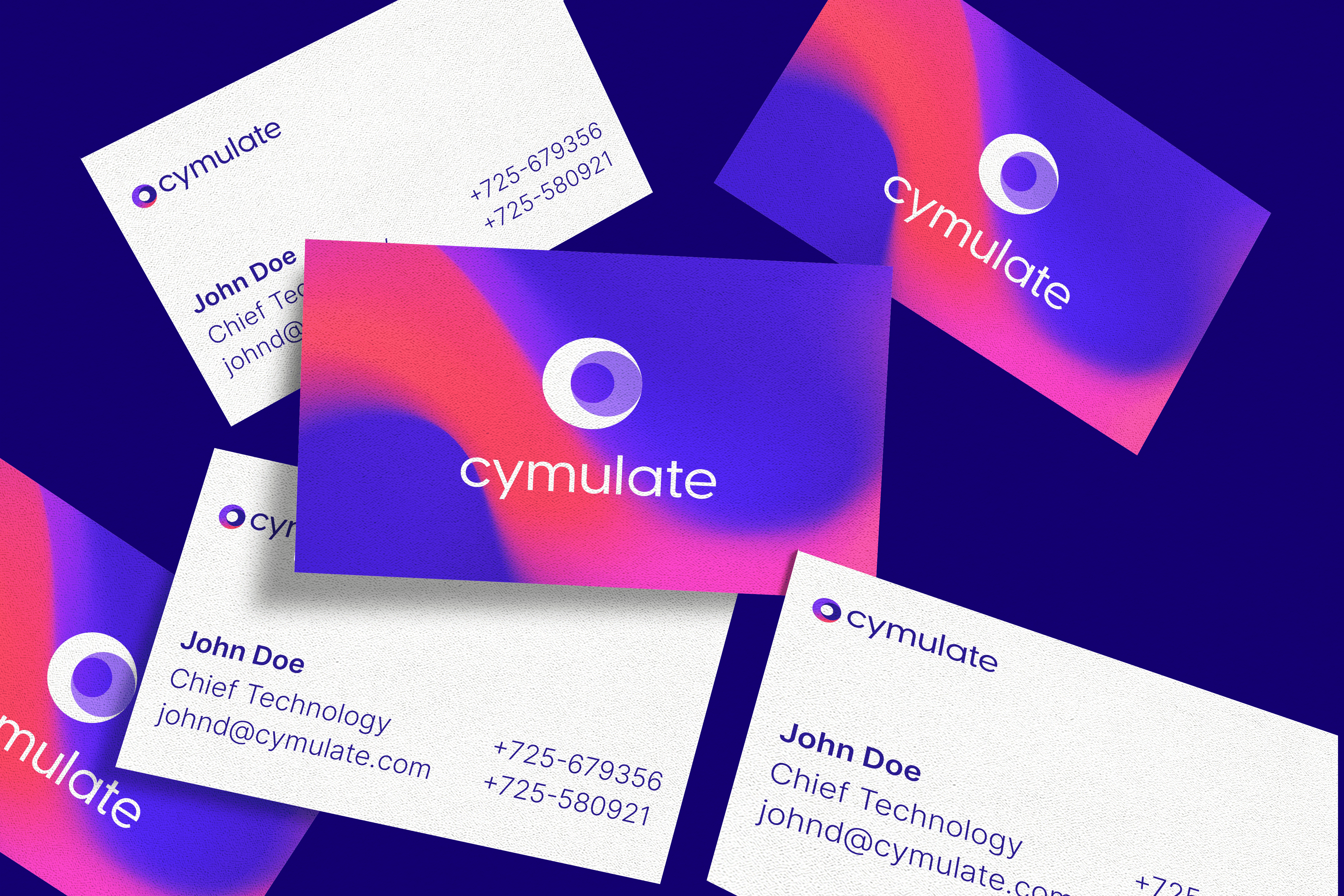
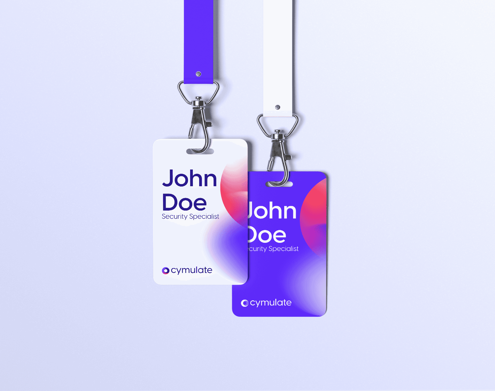
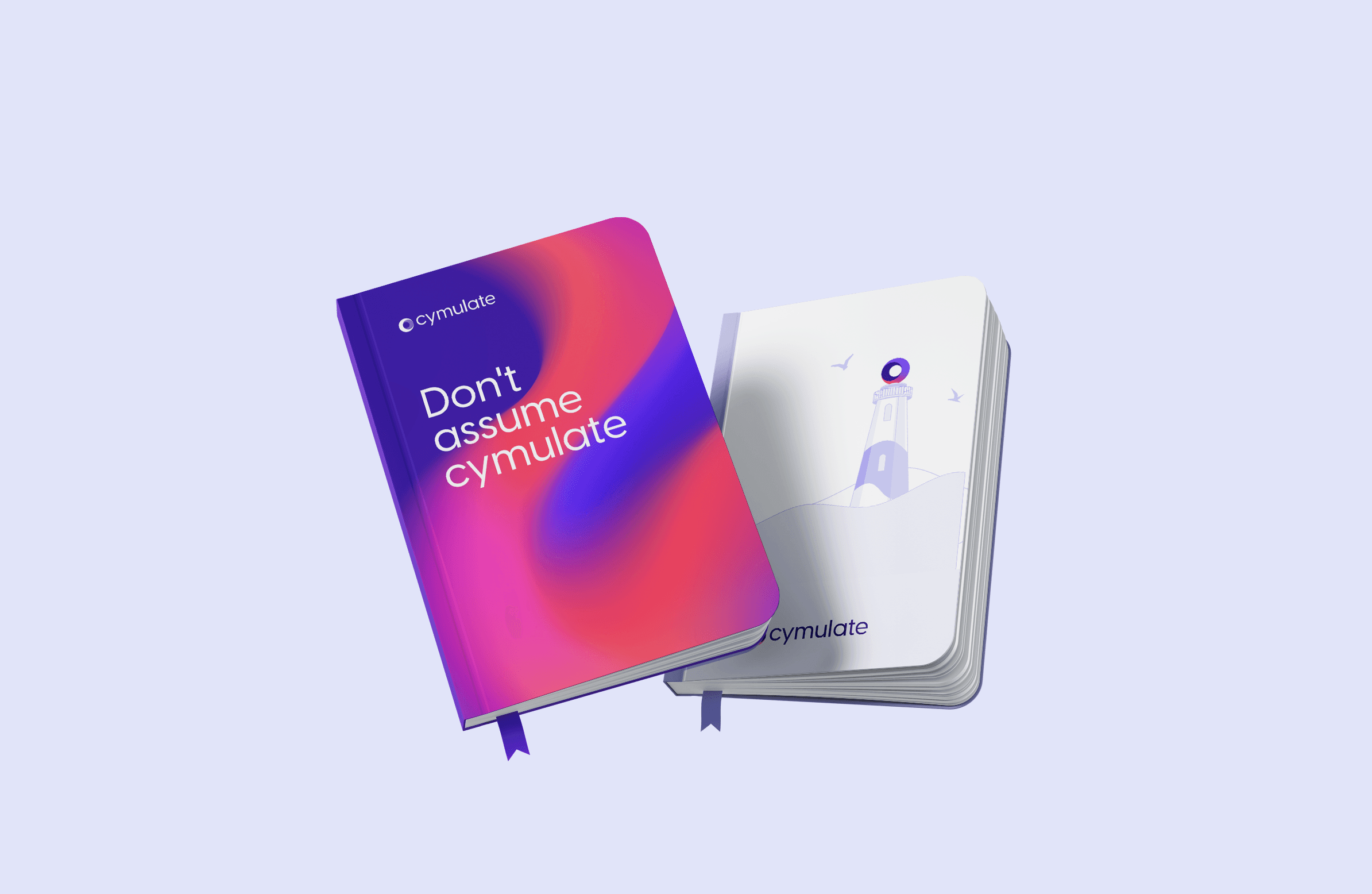
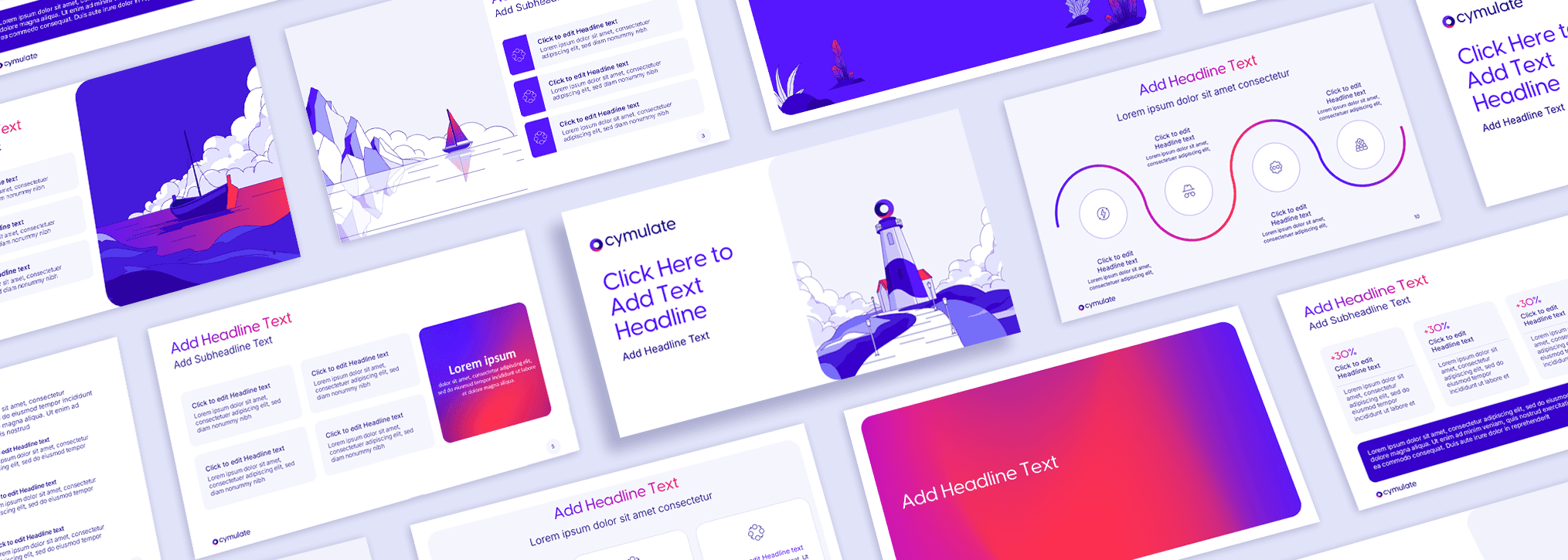
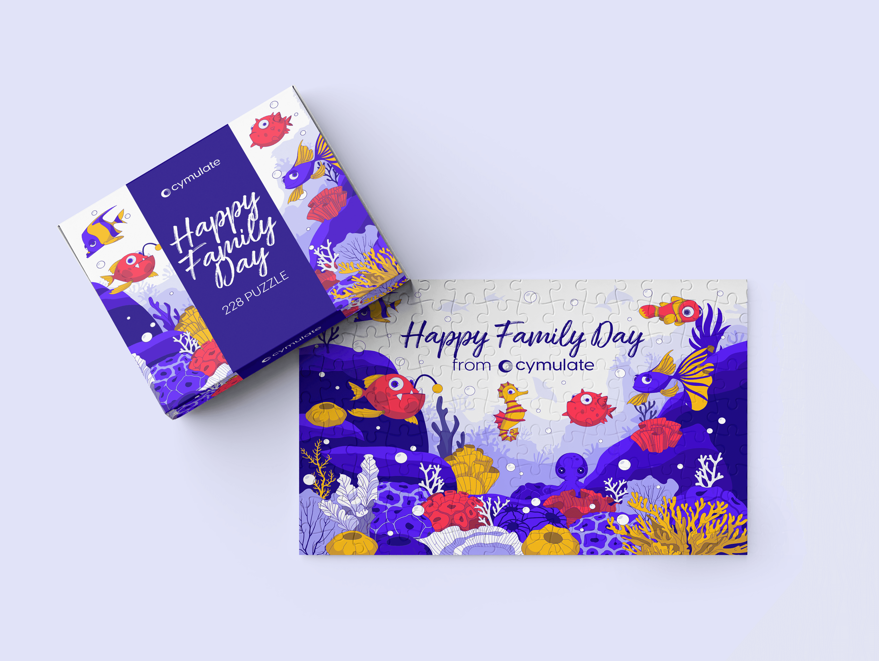
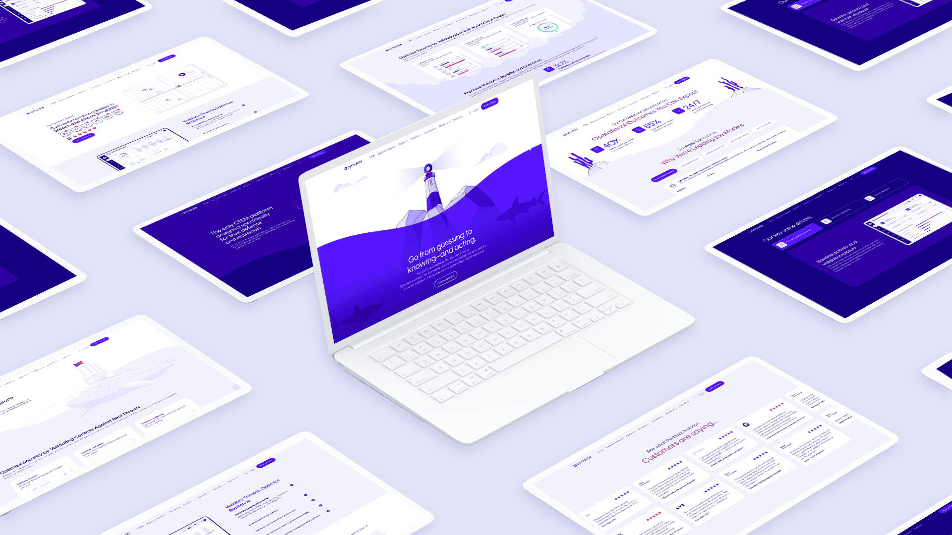
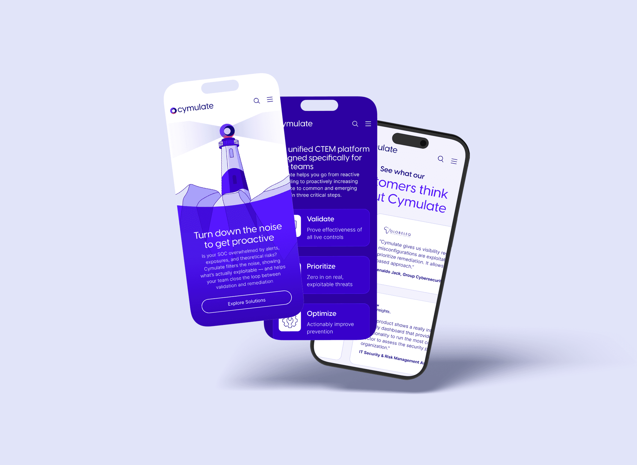
The logo is built around a circular form that encapsulates the core cybersecurity teams red, purple, and blue unified into a single, cohesive identity. This shape evolves within the visual language into a lighthouse, symbolizing Cymulate’s role as a guiding force in a vast sea of cyber threats. The sea represents the ever-changing landscape of attacks and vulnerabilities, while the lighthouse provides visibility, direction, and control. This concept extends across the entire design system, allowing the brand to scale consistently across a wide range of products while maintaining a clear and recognizable identity.
Meet the Octopus

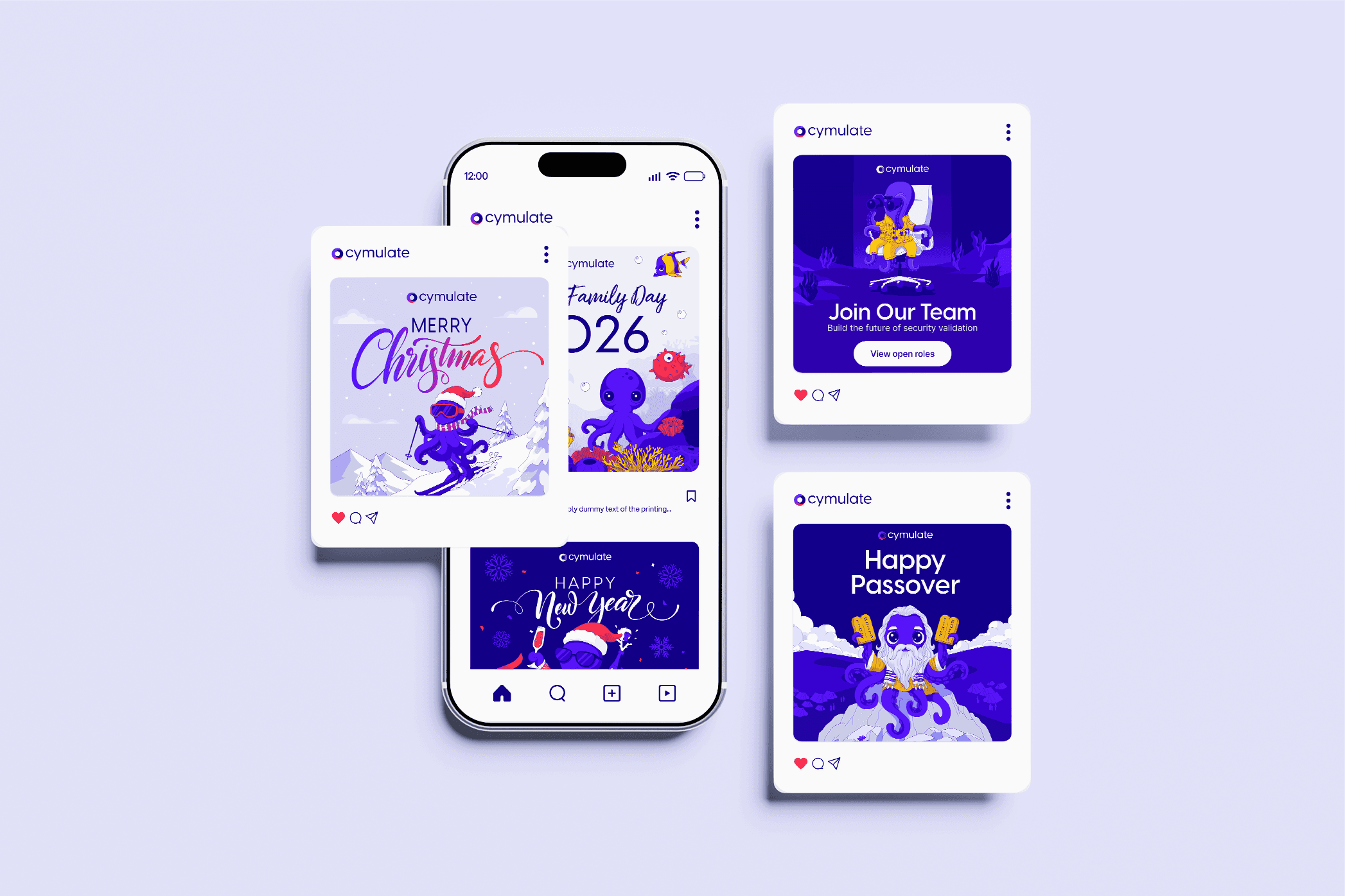
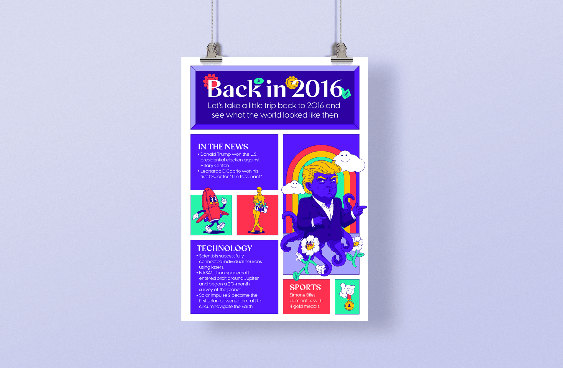
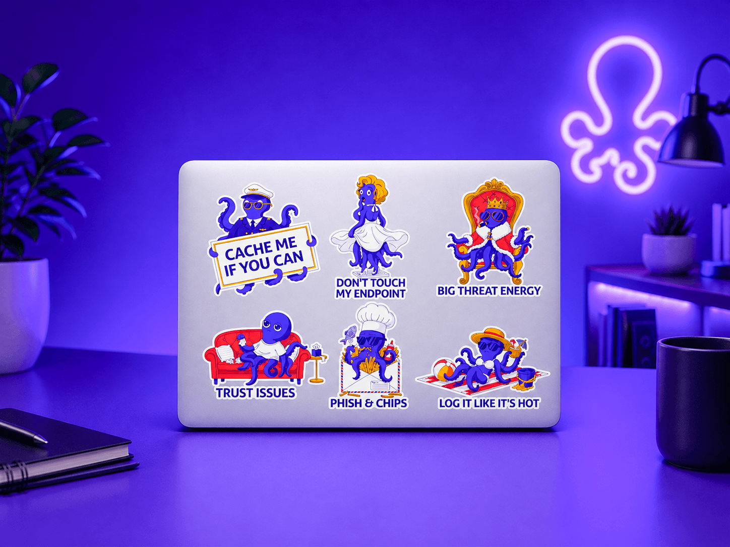
As part of the extended visual world, I developed an octopus character that brings personality and flexibility to the brand. Living within the same ocean-inspired universe, the octopus represents adaptability, intelligence, and the ability to handle multiple tasks simultaneously qualities that align naturally with the cybersecurity space.

The character is used primarily across social media and HR communications, supporting a variety of needs from internal engagement to external storytelling. It adds a human, approachable layer to the brand, helping communicate complex ideas in a more friendly and engaging way while maintaining consistency with the overall visual language.

As part of the extended visual world, I developed an octopus character that brings personality and flexibility to the brand. Living within the same ocean-inspired universe, the octopus represents adaptability, intelligence, and the ability to handle multiple tasks simultaneously qualities that align naturally with the cybersecurity space. The character is used primarily across social media and HR communications, supporting a variety of needs from internal engagement to external storytelling. It adds a human, approachable layer to the brand, helping communicate complex ideas in a more friendly and engaging way while maintaining consistency with the overall visual language.

Final observations

This project explores how a strong concept can unify a complex cybersecurity product into a clear and compelling brand experience. By combining the metaphor of the lighthouse with the vast sea of cyber threats, the design creates a balance between control and uncertainty guiding users through an otherwise overwhelming landscape.

The visual language extends beyond the core product into a complete ecosystem, from brand identity to digital interfaces and supporting assets. Elements like the circular logo, the integration of red, purple, and blue team concepts, and the octopus character all contribute to a cohesive and flexible system.

Ultimately, the project demonstrates how thoughtful design can make highly technical domains feel accessible, human, and intuitive while maintaining a strong, scalable, and memorable brand presence.

Anna Valezko

Senior Graphic Designer

If you like what you see or have any questions, feel free to send me an message anytime.

Drop me a follow

Available for work

Let’s create
something great together.

I'm not just here to design products; I'm here to connect with people.

Available for work

Let’s create
something great together.

I'm not just here to design products; I'm here to connect with people.

Drop me a follow

Available for work

Let’s create
something great together.

I'm not just here to design products; I'm here to connect with people.